Re-design, Packaging, 3d design, Product design
Brief by
JDO RAW
Awards
JDO RAW Shortlist 2021
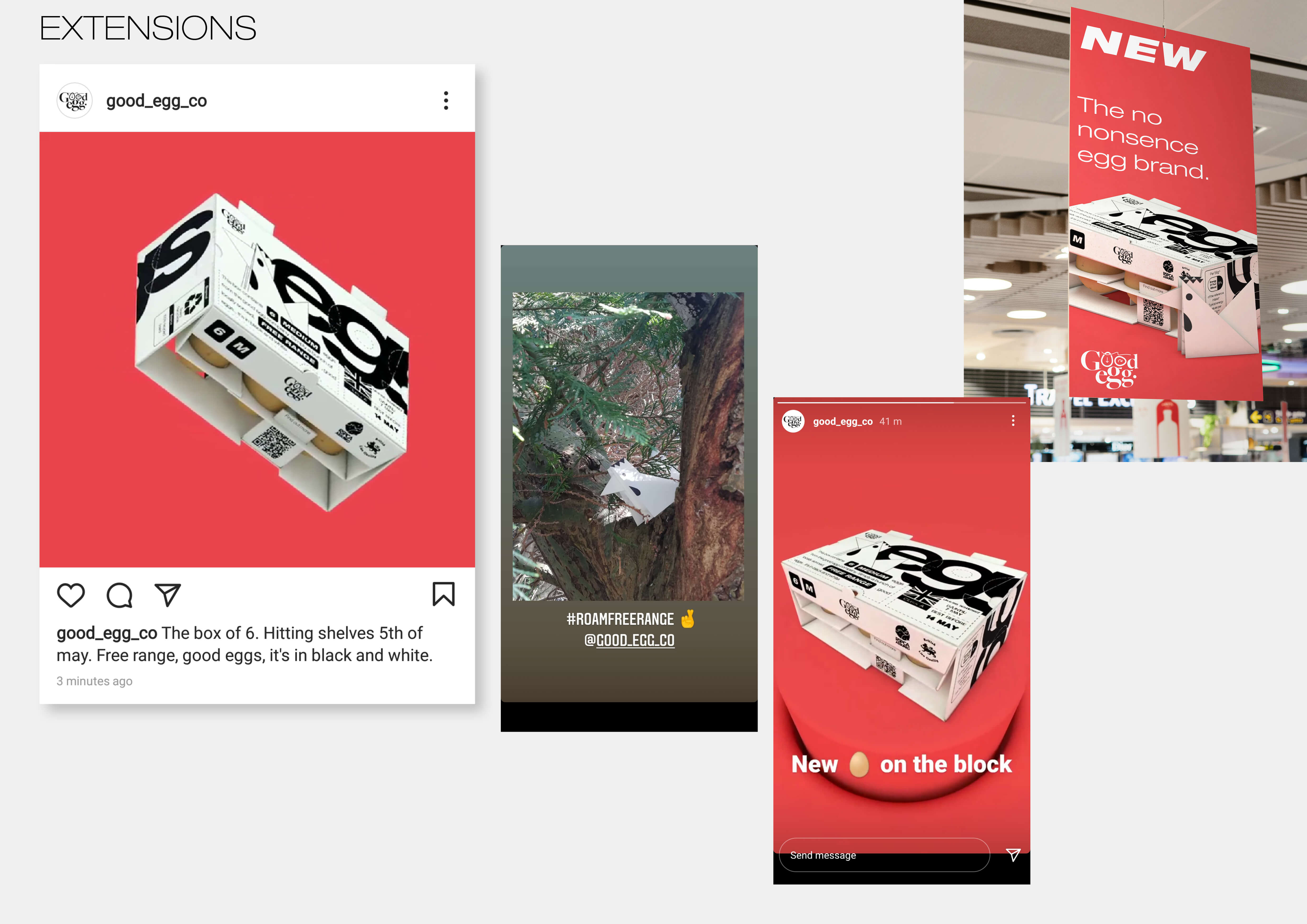
This project was a response to a brief set by JDO, "Unexpected item in bagging area" I chose to rethink and redesign the product I felt was particularly boring to look at or to buy. Eggs.
- Unexpected item in bagging area -
We want you to take the supermarket's most shocking packaging designs and turn them into something you'd be proud to put in your trolley.
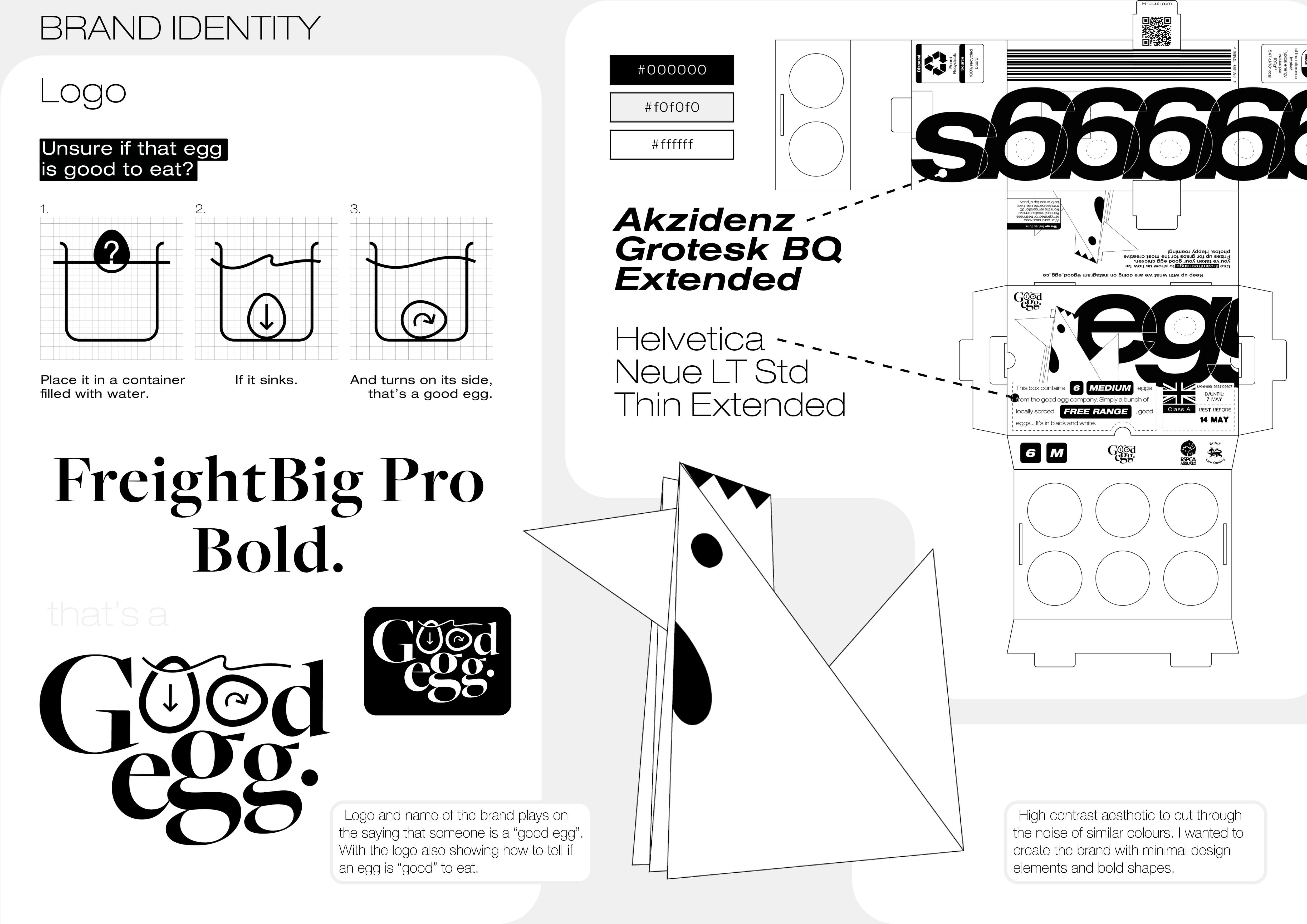
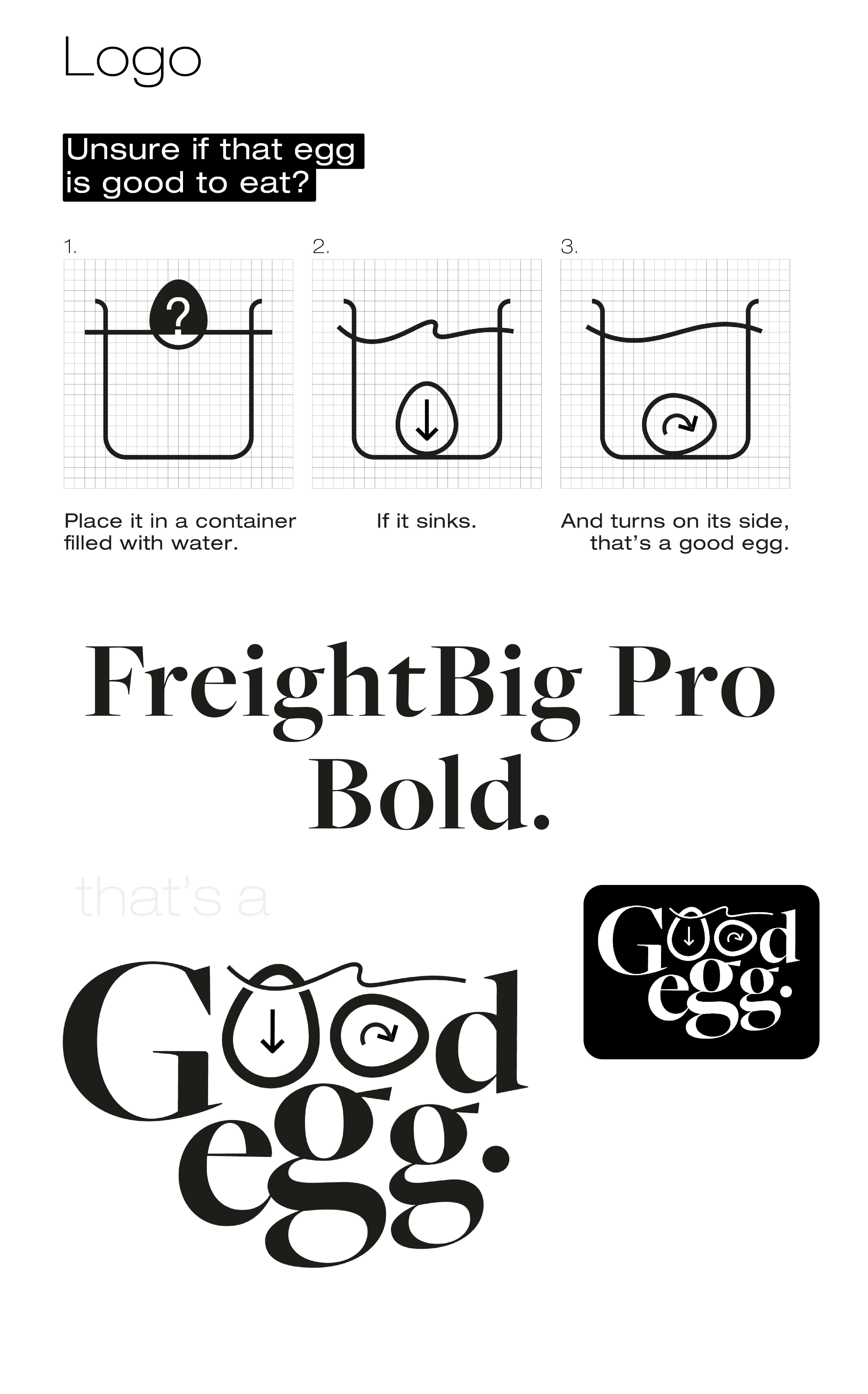
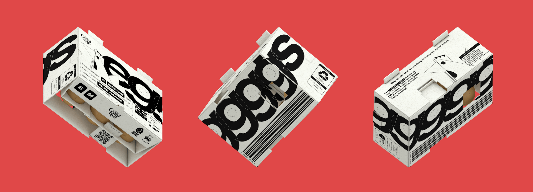
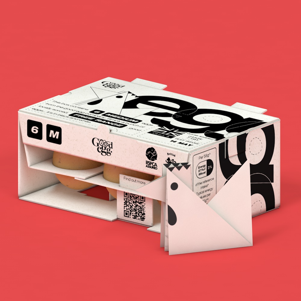
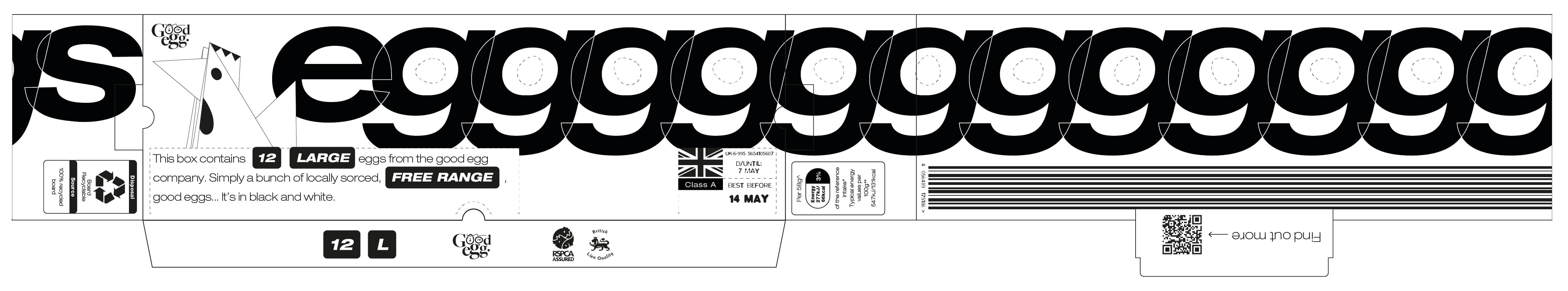
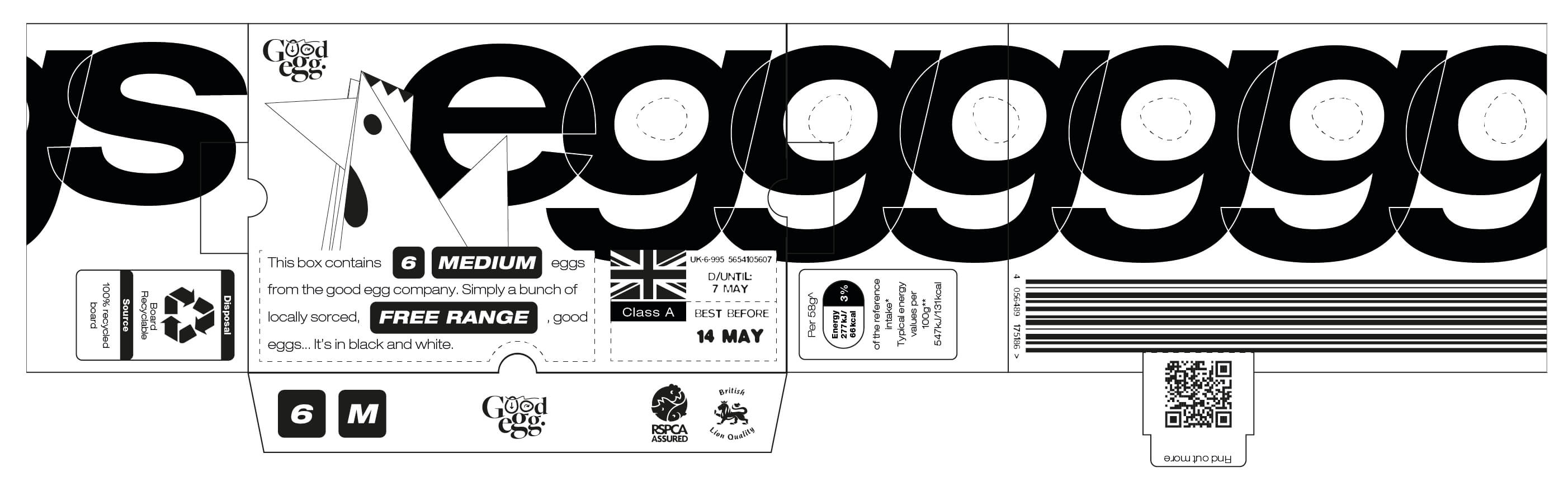
In creating the design language for the brand I set myself the task of redesigning the egg box,creating a box that could fold flat and be thrown away in order to save the space wasted in the recycling process. When looking at existing egg branding I felt that consumers don’t actually pay attention to it at all, looking only for the amount and size. I chose to use bold fonts and high contrast colours for the brand emphasising on the fact that the brand has values and sticks by them, no nonsense.
12 pack
6 pack