Publication Design, Type Setting, 3d effect, Print
Brief by
For People
The aim of this project was to try to encourage interaction between young and old generations. we wanted to show some similarities as the stereotype of the older generations not being with the times is unfair and we think there should be equal effort made by the younger population.
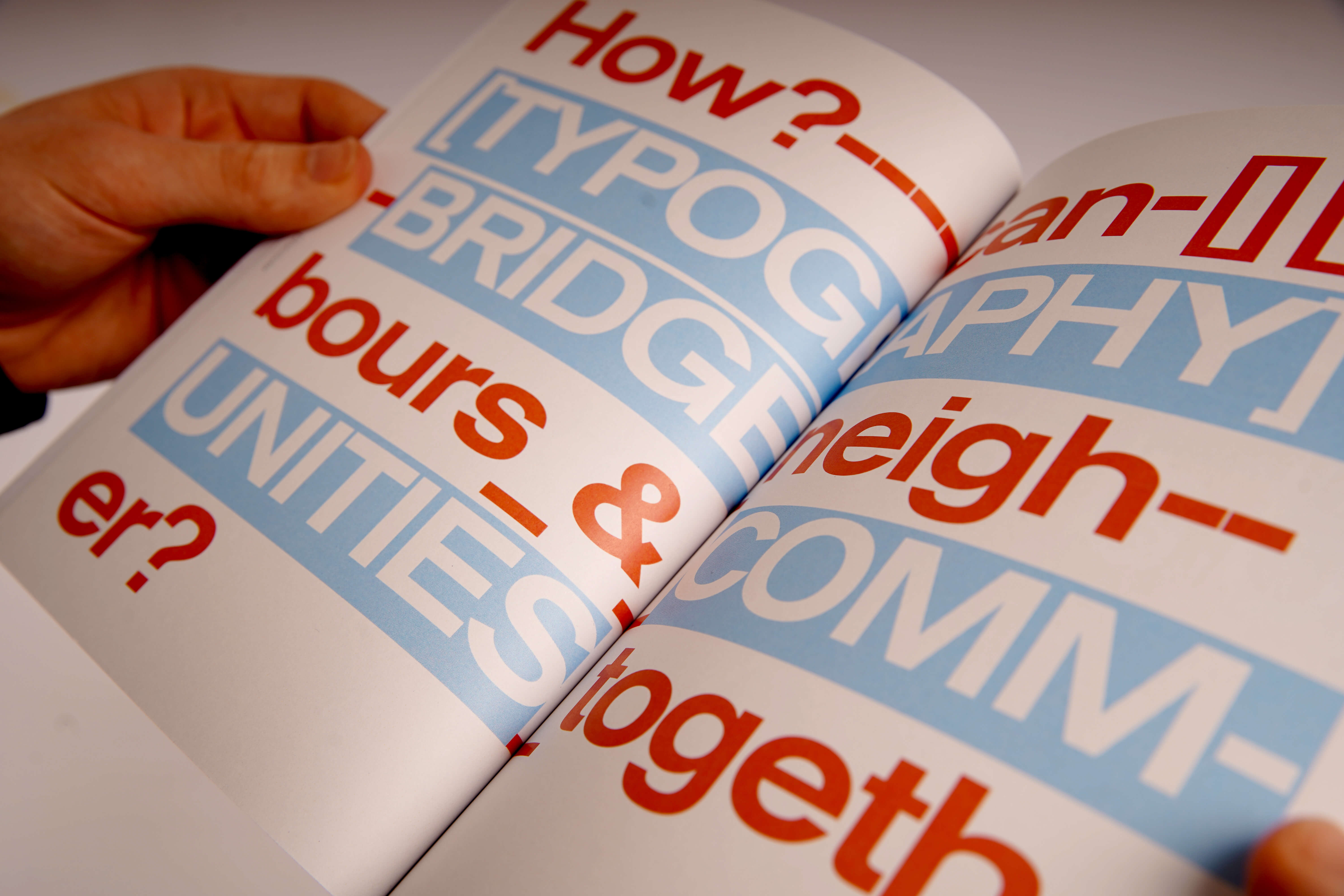
How can typography bridge neighbours and communities together?
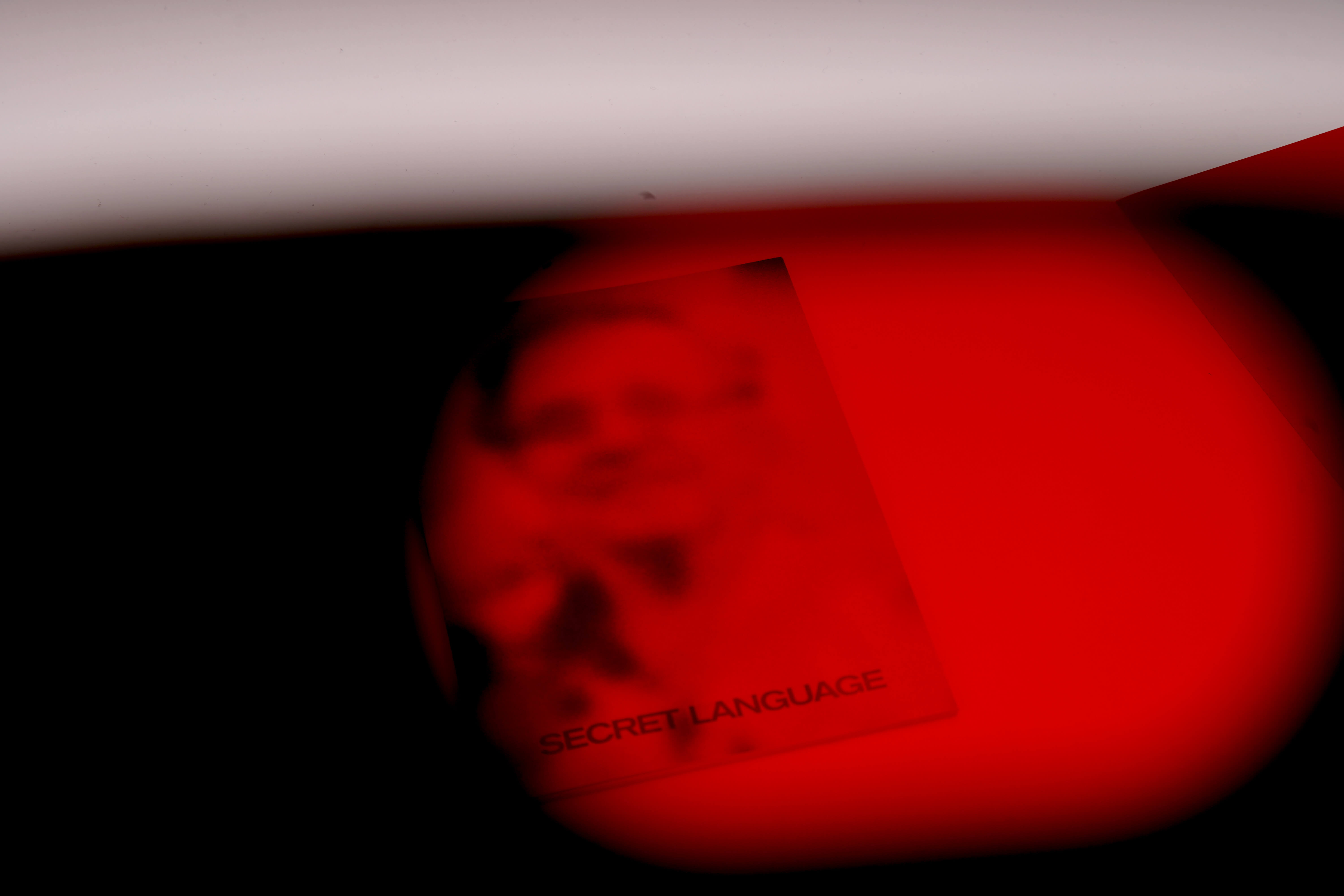
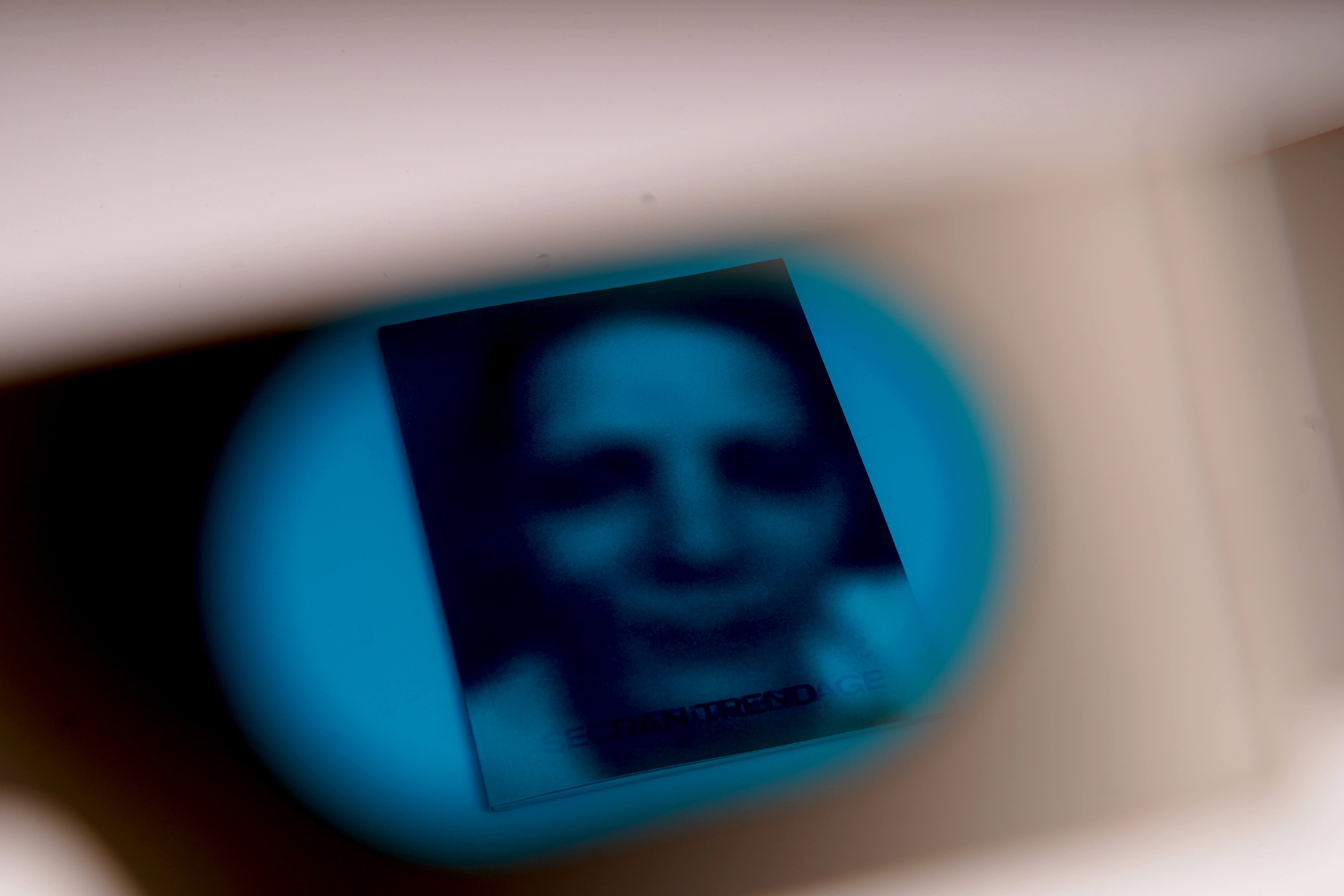
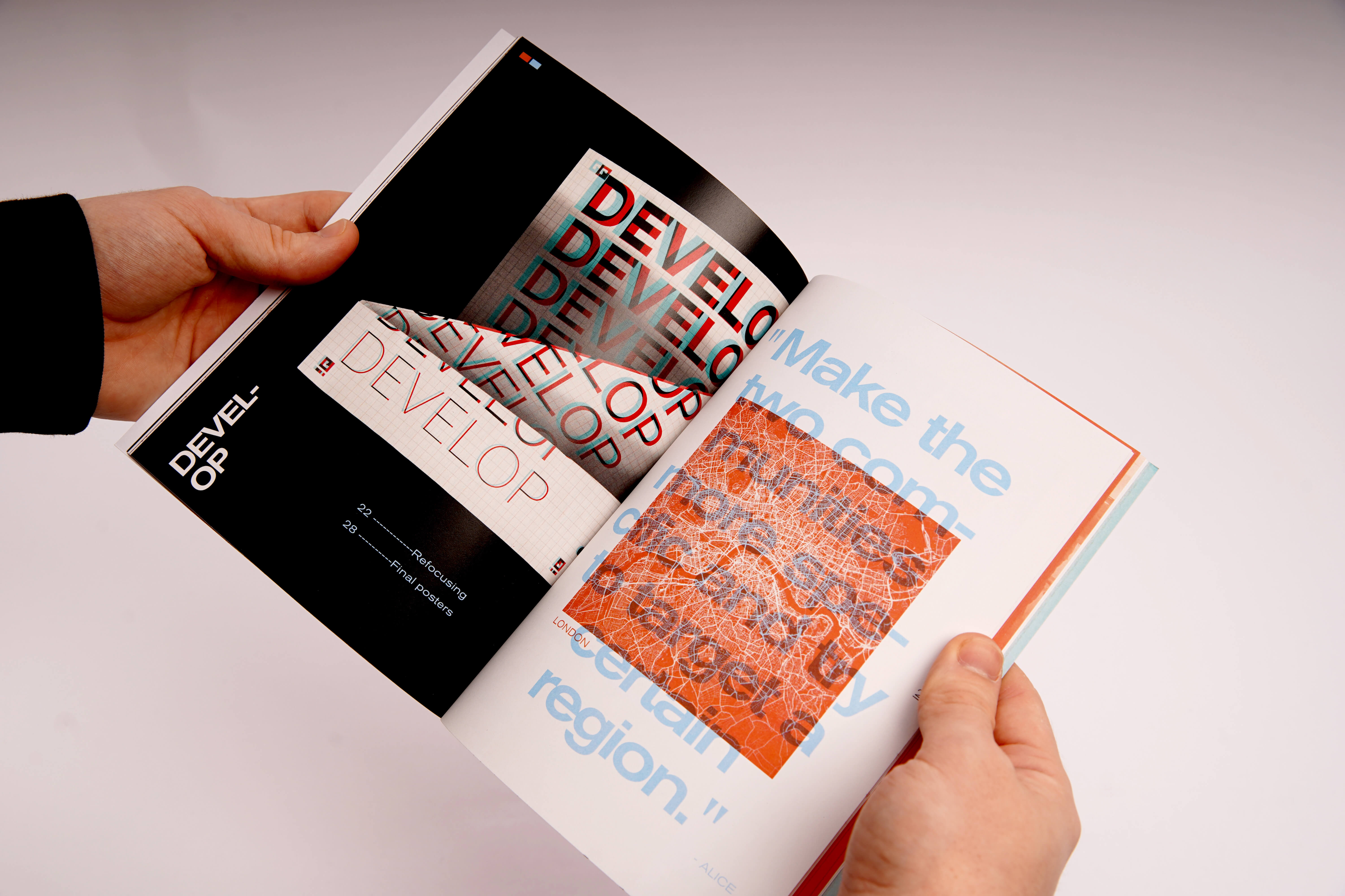
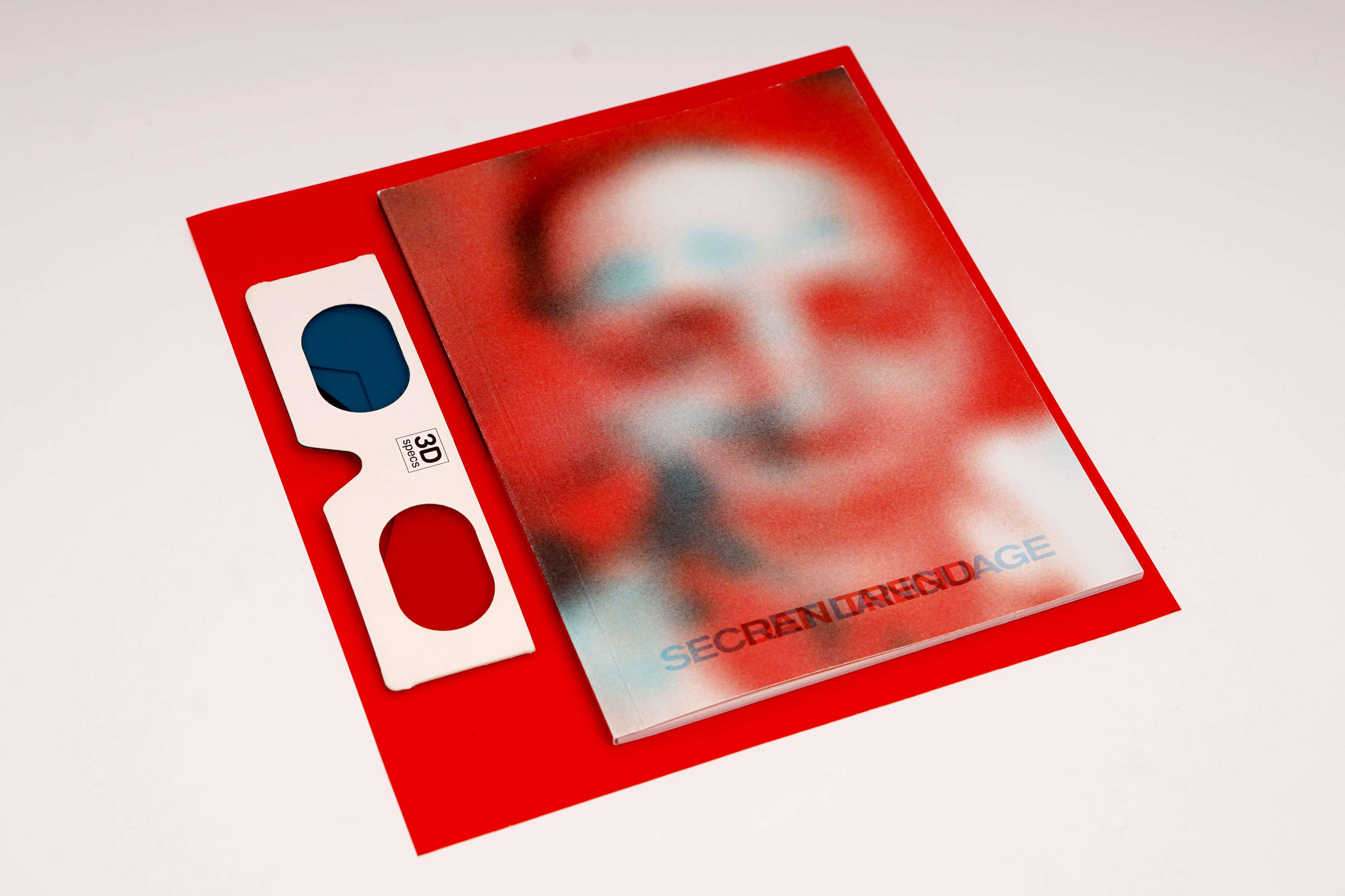
The project was a collaborative effort from Joshua Papps, Jacob Bennett, Chloe Burridge and myself, to meet the brief set by For People. For me the result of the ideation stage of this project was a process book that showed the development of the final outcomes. I wanted to communicate the two community groups in a way that was interactive so I used red and blue filters to "reveal" certain points of view or information that may not have been as clearly seen before.